This is the fifth in a series of posts on using performance excellence tools. It covers the basics of data analysis.
You have gathered your data and you are saying, I have all this stuff, now what do I do with it? It doesn’t make any sense to me. Your goal is to turn the data into information that will lead you to actionable opportunities for improving your process’ performance. You are looking for the root cause of the problem.
Unlike an attorney who should never ask a question in court without already knowing the answer, if you think you know the answer, you might not be asking the right questions. But if you want to draw the curve then plot the data to meet it, you are wasting time. The goal of the analysis process is to start to understand what is happening within your process.
Note: It is perfectly fine to gather data to verify an assumption that you have or to make certain that your process is working within specs.
There are many analytical tools available to you. The important thing to note is that the tools only get you part way through your analysis. You need to interact with the data, discuss it with others. Don’t get upset if you go down a few dead-end streets.
Using the accounts payable invoice model we started with in the earlier post we begin to analyze the results of the data gathering. There are 10 accounts payable clerks each tracked their time for 5 weeks. This gives us 50 days of data to work with.
What do we want to learn from the data? Let’s say that one of your assumptions is that some clerks markedly process more invoices than others. To confirm this, some basic questions you may want answered are how many invoices does each clerk process in a day? How long does it take to process an invoice? How do clerks compare to each other?
The first thing you have to do is make the data manageable. You have 50 data sheets. Each sheet has roughly between 100 and 300 data points. That gives you a potential of 5,000 to 15,000 data points. You need to get them into a usable format.
Figure 1 is an aggregate of the data needed to determine each clerk’s daily average of processed invoices.
 Figure 1 Aggregate Daily Average of Processed Invoices
If you tried to plot this you would wind up with a graph that looks like Figure 2.
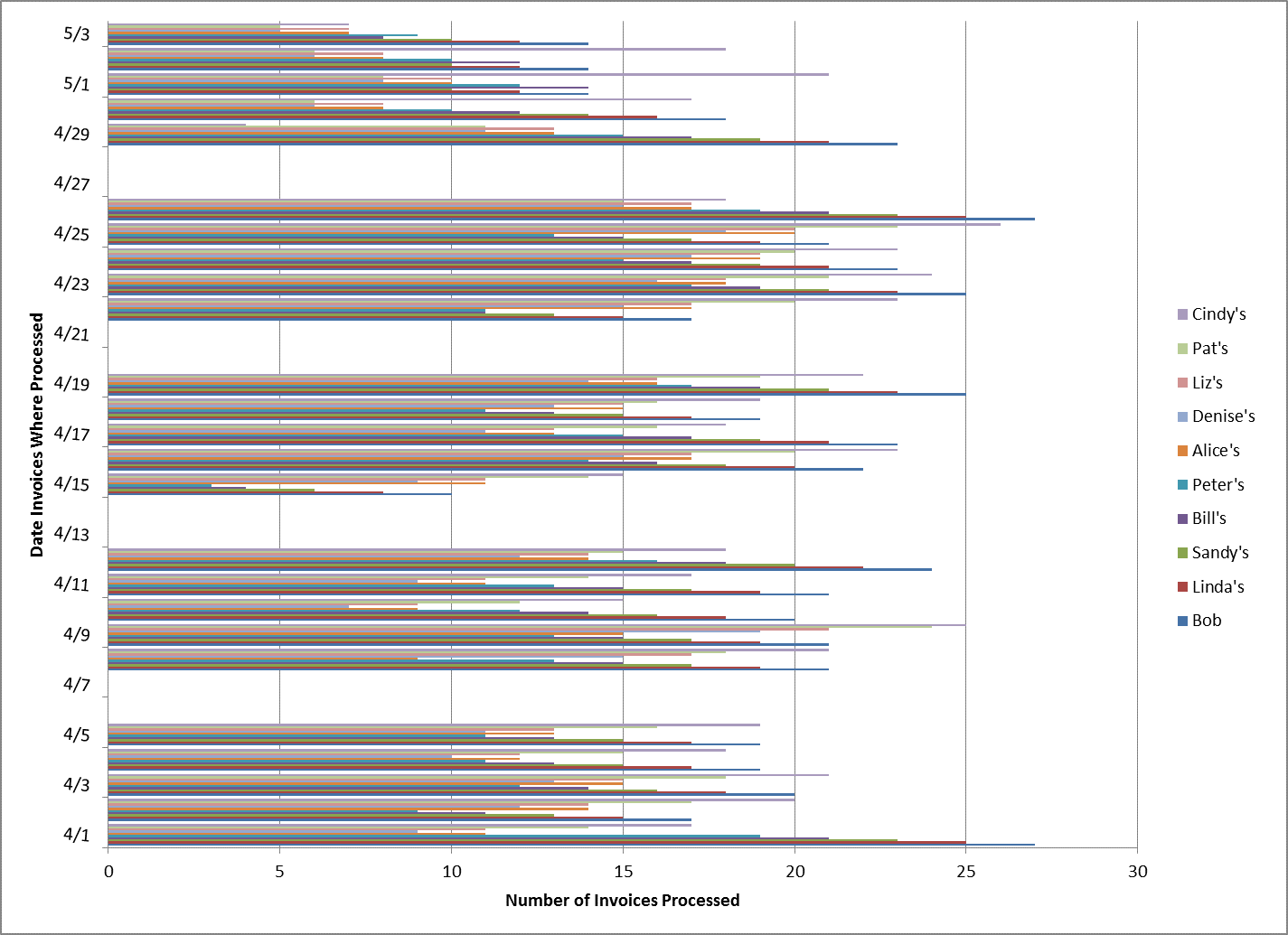
Figure 2 A Confusing Way to look at the Data
A better way is to get at the data is to look at each clerk’s daily numbers as an average and compare them to each other. Figure 3 shows Bob’s average daily output and includes the median and mean times which in this case happen to be the same at 18 per day.

Figure 3 Individual Clerk’s Average Number of Invoices Processed
You calculate the daily average for each clerk. Divide the lowest number by the highest number and put it in percentages. This gives you 57%. Invert that and you find that there is a 43% difference in productivity between the clerk who processes the most and the one who processes the least. But when you calculate the Mean (16), and the Median (15) you start to see that there is more to this than a simple delta between high and low.
Figure 4 shows the data plot on a bar chart.
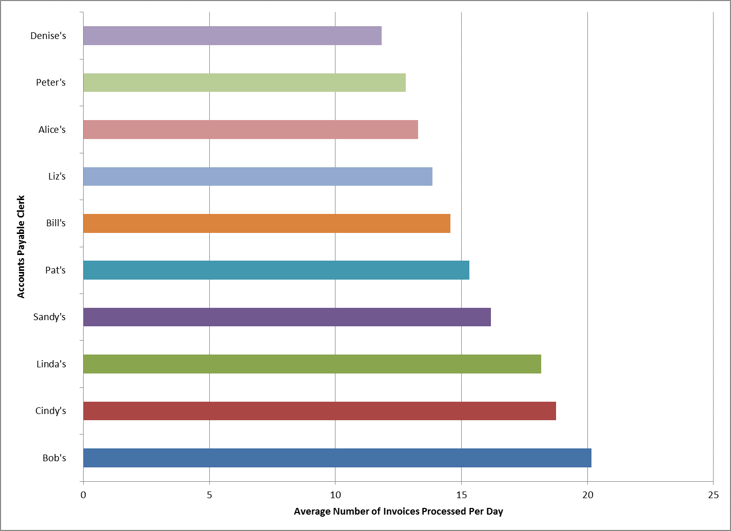
Figure 4 Bar Chart Comparing Clerks’ Output
If you convert the data into a histogram with a Pareto Chart output (Figure 5), you see there is more to the story. So you need to dig deeper which we will do in the next post.
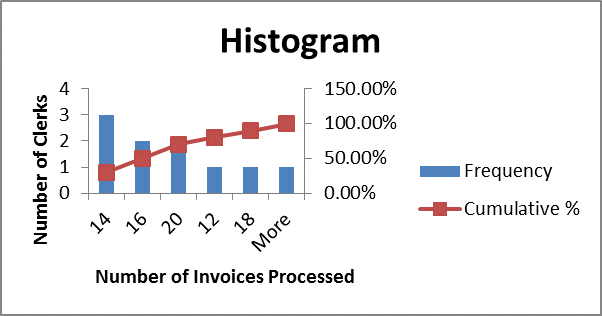
Figure 5 Histogram
