Using the Tools in Your Performance Excellence Toolbox: Part 18 Benchmarking Understanding Your Process

Using the Tools in Your Performance Excellence Toolbox: Part 18 Benchmarking Understanding Your Process

This is the eighteenth in a series of posts on using performance excellence tools.  Benchmarking is a tool that can really help you determine the best solution to your problem. However, to do it you need to know what to be benchmark.

Before you can benchmark your process, you need to understand it.  If you have been using a DMAIC, DFSS, Lean or some similar process, you should have identified where your needs are through the Measure and Analyze stages.  Your CTQs should identify for you what are the priority areas to benchmark.  It is not necessary to benchmark everything in the process only those critical to quality.

If you have not analyzed your process stop!

You must analyze it before going any further.  You need to know where the problems are.  They need to be measurable.  This is critical later on when selecting a benchmarking partner and when actually benchmarking.

As stated above use the tools in the Measure and Analyze stages particularly those that identify what is Critical to Quality, e.g. CTQ Tree, flowchart, value stream mapping, fishbone diagram, cause and effect diagram, SWOT analysis, etc.

Using the Tools in Your Performance Excellence Toolbox: Part 17 Benchmarking

Using the Tools in Your Performance Excellence Toolbox: Part 17 Benchmarking

This is the seventeenth in a series of posts on using performance excellence tools.  Benchmarking is a tool that can really help you determine the best solution to your problem.  It can point you to best/better practices.

First let’s understand what is meant by benchmarking.  “Benchmarking is the process of comparing one’s business processes and performance metrics to industry bests or best practices from other industries.”, http://en.wikipedia.org/wiki/Benchmarking

The easiest way to do this is to start by saying what it is not.

  • It is not a bogey or target that you set to measure internal progress. To illustrate this, I’ll relate a story from my experience as a consultant.  Consulting for a commercial records center, I asked the owner if he had benchmarks for key operations.  He said that he did.  The company had financial benchmarks to gage progress. That is not the type of benchmarking used in process improvement.
  • It is not an excuse to make a field trip.  When I was first introduced to benchmarking in the 1980s, the division that I was with had a rough time understanding how to properly use benchmarking.  Immediately people wanted to get in a car or jump on a plane and go talk to the “experts” in the field.  That was a huge waste of resources.
  • It is not even identifying the best in your business and talking to them.
  • It is not for the faint of heart, untrained or impatient.

Successful benchmarking requires the following steps:

  • Set aside a good amount of time to complete the process.  At a minimum you are going to spend 40 hours and for big processes with big problems you can be at it for months.
  • Clearly identified and documented gaps or inadequacies in the process you want to benchmark.  To do this you need to:
    • Analyze your process
    • Identify the errors
    • Identify potential solutions (this can be done before or after benchmarking)
    • Identify potential benchmarking partners.  This is the most critical point.  You are looking for the best practice for the process you are working on.  This may come from an unexpected place.  Too often people want to benchmark the best in their business not the best in the process.  Let’s return to the commercial records center for an example.

They were trying to improve their delivery process.  When I explained the need to benchmark, the owner immediately said let’s benchmark the largest in the business.  That was the wrong answer.  They needed to benchmark the best at delivery not the best commercial record center with the best delivery process.  If you are going to improve your delivery process you look to the organizations where that is a core function.  They needed to benchmark companies like FedEx or UPS.

You have identified your potential benchmarking partners.  Now comes the hard part – enlisting them.  Benchmarking partners are not always easy to enlist.  For some the reason they are the best is held as a trade secret or their key competitive advantage.  Put yourself in their position.  How willing would you be to share what has made you the best of breed?

You need to be able to answer their WIIFM (what’s in it for me).  Some potential partners are open to sharing because what you are asking does not pose a threat to them.  You may not be a competitor in their market or business.

Others may be willing if you sign a nondisclosure agreement with them.

One of the best ways to enlist a partner is to share with them your results or cross benchmark with them.

There is much more to benchmarking.  I will cover it in upcoming posts.


Using the Tools in Your Performance Excellence Toolbox: Part 16 Developing Your Plans

Using the Tools in Your Performance Excellence Toolbox: Part 16 Developing Your Plans

This is the sixteenth in a series of posts on using performance excellence tools. You have narrowed your potential solution to hopefully one or at most three.  Your next step is to develop the plans required to test your potential solutions.

First did you answer the questions in my post – Using the Tools in Your Performance Excellence Toolbox: Part 15 Selecting Your Potential Solution – satisfactorily for each of the potential solutions?

  • Do you have the required resources to implement the solution?
  • Does it fit your business culture?
  • Do you have the political backing needed to implement

If you read the standard works on Lean and Six Sigma on planning your solutions for testing, you will note that it is extremely heavily tilted to manufacturing particularly statistical analysis of the workflow.

For example control charts are generally set up to measure large amounts of data points, e.g. manufacturing 100 widgets an hour over 10 shifts a week or processing thousands insurance claims.

To use a control chart for low volume transactions requires some tweaking of design to help you track the performance of the process.  You have baseline data from your earlier stages post to start the measurement process.  Here is an example of a simple control chart using a MS Excel template.

Using a control chart

  1. Determine what a defect (imperfection) is.  A sample can have several defects.  In this example a defect could be:
  • Smudges
  • Misaligned page
  • Incomplete print/missing letters

2. Determine how big a sample size you are going to use.  Do you want to do a 100% sampling or a representative sampling?  The more you sample, the more accurate your results will be.  But the more it will cost you to do the research.

3. Determine the frequency of sampling.  How often you do you want to sample.

  • Example for points 2 and 3.  You want to sample one item in 10 on each line.  Or one item in 10 on every third line.

4. Record the number of defects per sample.

5. The chart automatically calculates the mean (average) for all the samples in the daily sample period.

6. It then calculates the mean for all the daily means.

7. The next four steps calculate the various deviations from the norm.

Control Chart

Many of the tools you can use during the planning step have already been discussed in previous posts.  These include:

Review your project charter.

If you did not create a Gantt Chart earlier, you need to do so now.  If you have one, it is time to update it to reflect the improvement plans steps.

Using the Tools in Your Performance Excellence Toolbox: Part 14 Affinity Diagrams, Making Sense of Brainstorming Results

Using the Tools in Your Performance Excellence Toolbox: Part 14 Affinity Diagrams, Making Sense of Brainstorming Results

This is the fourteenth in a series of posts on using performance excellence tools. Brainstorming potential solutions is an excellent jumping off point for improving your process/fixing the problem.

When brainstorming, remember that you must avoid the all too familiar approach of “here’s your solution now what’s your problem.”  Preconceived solutions are not necessarily to be ruled out completely or out of hand.  Some of them can be identified as you work through the earlier steps of the process.  In fact using a parking lot for these ideas as you work through the Define, Measure and Analyze stages is an excellent way of holding on to these ideas.  In other words don’t trust your memory, capture it at the time.

A parking lot is used when a thought, idea, notion, etc. comes up that is not appropriate for the current efforts but might be worth considering at another time.  Simply, capture the idea on a flip chart, in a spread sheet, in your meeting minutes, whatever works for you.

Brainstorming gets you a quantity of ideas on the table quickly.  It is the sorting out of those that have real potential vs. the others that have limited or no potential.

One method of sorting the brainstorming results is an Affinity Diagram.  This method allows you to take dozens or even one hundred or more distinct ides and consolidate them down to a few categories to work from in an amazingly short amount of time.

  1. Start by capturing each idea on a separate sticky note. (don’t forget those in the      parking lot)
  2. Randomly place the sticky notes on a wall.
  3. Have the team go up to the wall and sort the notes into groups.
    1. Note groupings (affinities) grow organically and are not set up in advance.
    2. They need to do this independently.
    3. The best results are when they do it in silence.
  4. One team member can move a note from the group that another had placed it in.  This is done until all the notes are in groups.  It is alright to have a few outliers that just don’t fit naturally into any of the groups – don’t force fit them.  Also don’t forget      about them or dismiss them, they may have the answer – the lone voice crying in the wilderness.
  5. After a while  (10 minutes to 30 minutes generally) the notes are grouped.

You should wind up with anywhere from two or three groups up to maybe eight.  If you have more than eightish groups, you may want to go back to the sorting and see if you can consolidate the groups.   Also if there are groups that could be merged into a broader affinity try to do that.

As a team look at the resulting groups and determine which ones have the most value/potential for leading to an improvement or fix to the process.

Affinity Diagrams are also a good tool to use to help sort out the results of focus groupsVOC feedback, distilling them into a CTQ Tree.

I use MindManager MindJet product occasionally to produce an Affinity Diagram.  This is especially useful when you have a project team with limited time available or who lack basic Lean Six Sigma training.  I gather the input from the brainstorming exercise and create the Affinity Diagram by myself.  This also works great if you are working on your own and want to organize your thoughts quickly.


Using the Tools in Your Performance Excellence Toolbox: Part 11 Project Status

Using the Tools in Your Performance Excellence Toolbox: Part 11 Project Status

 This is the eleventh in a series of posts on using performance excellence tools.  It outlines the necessity for and options for deciding whether or not to move forward.

When working on a project it is essential that periodically you review its progress.  This should be done at specific points in the project and if necessary ad hoc at other points if circumstances require.

A project review or status report provides the opportunity for the team leader and its sponsor(s) to determine how things are going.  It is a time to discuss identified issues, change the requirements, decide whether to proceed, etc.

There are several ways to conduct these reports.

  • Tollgate – In Six Sigma and Lean Six Sigma these are formal meetings scheduled between the team leader and the project sponsor at the end of each stage.  Other members of the team and interested parties can attend but only the leader and sponsor are required.

At the tollgate the team leader reports on the progress of the stage.  It summarizes the various measurements conducted and where the project stands against plan.  In the review you discuss progress, issues, barriers, etc.   If a change is required, a scope change process should be followed.  This includes changes to the project charter.

A storyboard should be used to facilitate discussion.  A storyboard summarizes the key aspects of the stage’s work.  These can be constructed in a number of ways.  I use a PowerPoint template that looks like this.

storyboard

Figure 1 Example of a Tollgate Storyboard

  • In a Stage Gate Innovation process you conduct a decision diamond review.  These are more complex than a tollgate, involving numerous individuals.
  • Formal and informal review sessions.  These include perhaps being part of a normal review meeting with your boss if they are also the sponsor where the project is one of several items on the agenda.

This approach is better suited to brief updates and FYI for your boss if they are not directly involved in the project.

The critical deliverable for the status reviews and is paramount in the tollgate and decision diamond meetings are the determination of the next steps for the project.

There are four possible outcomes to the status reports.

  • The sponsor is satisfied with the deliverables for the stage and authorizes the project to move forward.
  • The sponsor is not satisfied with the deliverables for the stage and requires you to do additional work before authorizing the project to move forward.
  • The sponsor is not satisfied with the deliverables for the stage, determines that it is necessary to go back to an earlier stage.
  • It is determined that the project is to be terminated or shelved.  This can be for a number of reasons including the team has discovered that the desired results cannot be achieved, resource cutbacks, the market are not ready, there is a technology gap, etc.

It is important to remember that the cancellation of a project is not a negative reflection on you, the team or the work done.  In fact one of the great benefits of a status report is that it helps the organization conserve its resources and apply them to the most promising projects.

In summary, I have been the recipient of all of the potential outcomes.  In some cases, I have recommended to the sponsor that the project be cancelled, with others fought to keep them going (always with data – not personal whims in all cases).  The point being that a project with merit, led, staffed, and supported properly will stand up to scrutiny.  If it doesn’t meet the criteria let it go.  Nothing hurts an organization more than wasting resources on unnecessary projects or those with unattainable goals.

Using the Tools in Your Performance Excellence Toolbox: Part 10 Cross Functional Tools

Using the Tools in Your Performance Excellence Toolbox: Part 10 Cross Functional Tools

 This is the tenth in a series of posts on using performance excellence tools.  It covers how most of the tools already discussed can be used in different functions and stages of performance improvement.

Novices and purest can make a mistake when selecting and applying tools.  They think that a tool is specific to a discipline approach such as Six Sigma, Lean, PMBOK, etc. or a stage of that discipline and can only be used in that discipline or stage.  Or worse that every tool identified for a stage must be used.  Neither is correct.  The best tools to use in any stage are the tools that meet the requirements — that get the job done.  This includes tools not normally associated with performance improvement.

These tools can be used the same way whether you are doing the first three stages of Lean Six Sigma, Six Sigma DMAIC or Design for Six Sigma DMADV.  In all of these you need to Define, Measure, and Analyze.

The table below lays out the tools and what stages they are generally used in.  The dark shaded cells indicate that the tool is a primary one for that stage.  The light shaded cells indicate that it should be referenced in the stage.  This is especially true for the Charter, Gantt Chart, and CTQ.

Cross Functional Tool Matrix

Avoiding Scope Creep in Your Performance Excellence Project

This post covers one of the top risks to any project and one of the top project killers and banes of a project manager, scope creep.

Scope creep is a continuous threat that if not managed properly can derail your project.  Scope creep is defined as: “The tendency of a project to include more tasks or to implement more systems than originally specified, which often leads to higher than planned project costs and an extension of the initial implementation date.”[i]

Scope creep can come from a number of sources.  You need to be on the lookout for all of them.

  • Your sponsor may see a link between your project and an idea that someone else has presented and decide to add that idea to the project.
  • They may tell you that it is a good fit or it dovetails nicely with your project.
  • Management may want to change the deliverables to fit their newest flavor of the month or new business model.
  • An interdependent project may want you to take on some of their projects objectives, often to relieve constraints on their budget or resources.
  • Don’t forget yourself.  You may want to add something as you work through the project.

What do you do when confronted by scope creep?  Perhaps the simplest thing to do is to just say “It’s out of scope.”  Before doing this, be certain that you can get away with it.  It may not sit well with the power brokers.

The best approach is to document what the impact of the scope creep will have on the project.  Using the Project Management Triangle, you can show those who want to add to the scope that it will increase at least one of these if not multiples; cost, timeline, scope (deliverables).  See my post of July 4, 2013 for information on the Project Management Triangle.

In summary, if you hear “Hey – While you’re at it, why don’t you just…” Run for cover! Your project is about to get all messed up.

Using the Tools in Your Performance Excellence Toolbox: Part 9 Scope Change

This is the ninth in a series of posts on using performance excellence tools.  It covers a critical component of project management Scope Change and the tools used to manage it.

Changing the requirements of a project requires a review of the project’s charter.  The charter is a living document.  As the project progresses, you will almost certainly have to make changes to the charter.  When changing the charter, be certain that the sponsor reviews the changes, approves them and signs the revised charter.  Also make certain that the team is aware of the changes.  Do not work in a vacuum.

A formal Scope Change process may be required and is an effective tool to use.  If you do not change the project scope, you may give your sponsor a nasty surprise when the project is late, over budget or delivers less than required.

In his article on scope change management Tom Mochal states, “Smaller projects can document the scope change in a short form or an e-mail. For larger projects, the scope change request should be formally documented using a Scope Change Request Form. The important thing is that you need to document the scope change in writing. Don’t act on scope change requests you receive verbally.”[i] Figure 1 is an example of a scope change sheet in MS Excel.

scope change

Figure 1 Scope Change Template

Why do you have to manage Scope Change?   When you agree with your sponsor and team on the project’s charter, you agree to a set of deliverables, the timeline for completing the project, and the resources that will be made available for it.  This is the scope of the project.  An easy visual for understanding this is the Project Management Triangle.  The Project Management Triangle is an equal lateral triangle that traditionally has three constraints “scope,” “time,” and “cost”.  You cannot alter one side of the triangle without affecting the others.

The time constraint is the amount of time you have to complete the project. The cost constraint is your project budget. The scope constraint refers to what you must do to meet the project’s requirements. These constraints often compete: if you increase the scope typically you will have to increase the time and/or cost. A tighter time constraint could mean increased costs and reduced scope, and a tighter budget could mean increased time and reduced scope.

Figure 2 is the balanced Project Management Triangle that you start the project with.  The Time, Cost and Scope are in equilibrium.  You have enough resources (costs) and time to deliver the deliverables (scope).

proj magt tri 1

Figure 2

If any of the three sides change, that change will impact one or both of the other two sides.  Figure 3 illustrates that if the deliverables are increased then both costs increase and the time required to complete the project also increases in this example.

proj magt tri 2

Figure 3

Figure 4 illustrates how if the timeline is reduced then the deliverables are reduced to offset the decreased amount of time available.  An alternative to reducing deliverables is to increase the resources available, obviously this increases costs.

proj magt tri 3

Figure 4

A preventive method is to have the team conduct a risk assessment when setting up a project.  In nearly every risk assessment that I conduct at or near the top of the assessment is scope creep.  By addressing scope creep in the risk assessment, you are forced to determine the likelihood of the risk occurring and its potential impact on the project.  In addition, the risk assessment forces you to have a mitigation plan and a contingency plan in case the risk occurs.


Using the Tools in Your Performance Excellence Toolbox: Part 6 Basics of Data Analysis – Continued

Using the Tools in Your Performance Excellence Toolbox: Part 6

Basics of Data Analysis – Continued

This is the sixth in a series of posts on using performance excellence tools.  It continues the discussion on the basics of data analysis.

Figure 1 shows the conversion of the data into a Histogram with a Pareto Chart output.  A short summary of the purpose of a Histogram is the data distribution shown by rectangular columns that represent the frequency of the data points collected into “bins”.  A Histograms displayed as Pareto Charts, provides a distribution in order of frequency from highest to lowest.  It also shows the percentage of each bin.

Histogram

Figure 1 Histogram as Pareto Chart output

Figure 2 shows a standard Histogram where data is distributed in ascending order of the value of the “bins” vs. the percentage of the number of data points or occurrences.

 Histogram 2.gif

Figure 2 Histogram

This starts to show some of the differences in more detail.  You notice that 60% of the clerks process an average of 16 or less invoices a day.  You need to look deeper into the data.

Try to answer why there is such a delta between the high and the low.  You will have to dig into the raw data more.  Look at each clerks’ data as a self-contained unit.  When you compare Bob to Liz (Figure 3) (Bob processes the most, Liz processes a little below the average) you see that Bob asks Liz for help every time he has an invoice from supplier D.  This interrupts Liz and tacks on additional time to her average processing time.  It does not add to Bob’s time since it is not counted as an interruption.

bob v liz

Figure 3 Comparison of April 5’s data

 But this doesn’t identify the root cause of the problem.  You now need to find out why Bob interrupts Liz when he has invoices from supplier D.  You can take to flights of fancy if you want (but it will be of little value to you in the end), e.g. maybe Bob has a thing for Liz.

You then do the same type of analysis with the other clerks to see if a pattern arises.  The results show that Bob asks for help far more than anyone else and he asks for the most help from the senior clerks who also happen to process the lower numbers of invoices.

To get to the root cause(s) use the 5 Whys.

The 5 Whys is an extremely simple tool to use that is also very effective. You state the problem and then proceed to ask why is this a problem?  Answer that and ask why is this a problem, and so on.   It is like peeling an onion.

Pose problem: Bob requires help with Supplier D invoices thus interrupting other clerks.

  1. Why? Bob needs to learn the intricacy of dealing with all the suppliers.
  2. Why? Bob has been targeted as a potential supervisor and is receiving OTJ training.
  3. Why? Management wants potential supervisors to be taught by the SMEs.
  4. Why? They think it saves them training expenses.
  5. Why? No direct cash outlay for training.

Another result of your data analysis identified that Supplier D’s invoices required more time to process than the other vendors almost uniformly regardless of which clerk processed them (Figure 4).

Invoice time

Figure 4 Average time to process an invoice by supplier

Pose problem: Supplier D’s invoices require more time to process.

  1. Why? Supplier D invoices are lengthy and more complicated than the other suppliers.
  2. Why? Supplier D submits multiple separate invoices but requires payment by one check.
  3. Why? It is Supplier D’s standard policy and Bob’s company’s procurement doesn’t push back on this.
  4. Why? Supplier D is the sole source of this material for the company.
  5. Why? Procurement doesn’t want to risk losing their sole supplier.

You have found two potential root causes.

Using the Tools in Your Performance Excellence Toolbox: Part 4 Data Gathering

Using the Tools in Your Performance Excellence Toolbox: Part 4
Gathering Data

This is the fourth in a series of posts on using performance excellence tools. It covers the reasons for and basic methodologies designed to help you gather baseline data.
Why gather data? There are numerous phrases to explain why:
• Data is king!
• “What gets measured gets done” (attributed to numerous individuals)
• “Without a standard, there is no logical basis for making a decision or taking action” Joseph Juran
• And my favorite – “In God we trust, all others bring data.” W. Edwards Deming
But the basic reason is that without a baseline to work from you do not know if or how much you are improving your process. And without data you can’t determine your baseline.

What is data? “1. factual information (as measurements or statistics) used as a basis for reasoning, discussion, or calculation …” http://www.merriam-webster.com/dictionary/data

Data and information and occasionally even knowledge are used interchangeably, though incorrectly. You are gathering data not information to set the baseline.

So how do they differ? Data is the raw facts about the process (symbols such as numbers). Information is an analysis and configuration of the data (often stated to be achieved by human interaction on data) that makes it useful. Knowledge is the combination and reflection on the information to answer the how of a question.

I have come across some people who use surveys, interviews, focus groups, etc. to “gather data.” To me this is VOC not data gathering since there is very little if any raw facts gathered. Oh well, to each his own.

Now that we have defined data, how do we collect it? First what type of data are you looking for? It must be quantitative in nature. Quantitative data:
 Deals with numbers
 Can be measured
 Examples: Length, height, area, volume, weight, speed, time, temperature, humidity, sound levels, cost, members, ages, etc.

In addition to quantitative data you can use Qualitative (note in addition to not in place of). Qualitative data:
 Deals with descriptions
 Can be observed but not measured
 Examples: colors, textures, smells, tastes, appearance, beauty, etc.

Three things to remember when gathering data:

• KISS it (Keep It Simple Stupid) unless it is absolutely necessary, e.g. high complex manufacturing process), keep the data gathering as simple as possible
• 3 bears rule
1. Not too little
2. Not too much
3. Just enough
3 bears

• Verify it – is it trustworthy, reliable, repeatable

You need to be aware that you don’t become infected with the paralysis by analysis virus. The first signs appear during data gathering and include the irresistible urge to just get one more piece of data.

The basic way to gather data is by using a data gathering worksheet. These are customized to your specific needs. I generally use an Excel Workbook for by data gathering. This allows a great deal of flexibility and you can add as many worksheets as you need to tailor your responses.

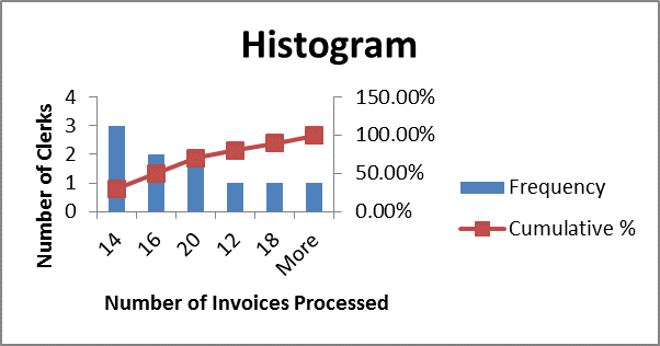
For example suppose you wanted to collect data on the time it takes the Accounts Payable staff of 10 to process invoices.

Determine the sample size and duration (number of cycles).
Sample size – 10 employees
• Duration – 5 weeks (each day is a cycle)

You set your data point requirements. In our case they are:
• Employee
• Date
• Supplier
• Start time for each invoice
• End time for each invoice
• Start time for each interruption
• End time for each interruption
• Type of interruption

Data Gathering Worksheet
Figure 1 Data Gathering Worksheet

Each employee will complete a worksheet each day during the data gathering cycle.